New functions in GS-Calc 22 include new chart types and more chart
configuration options.
-
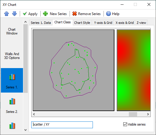
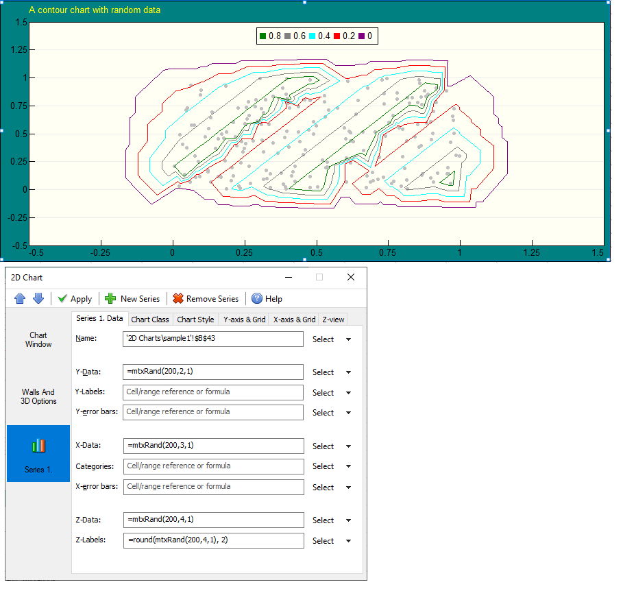
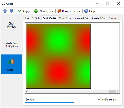
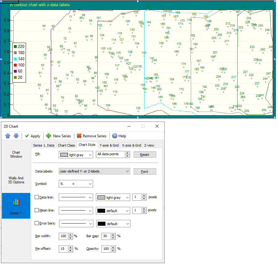
Contour charts and color maps.
You can create contour charts with up to 32 million data points in one data series,
with fully definable or automatic isolines. The “Chart” dialog box now
includes these new types as well as the respective configuration options.
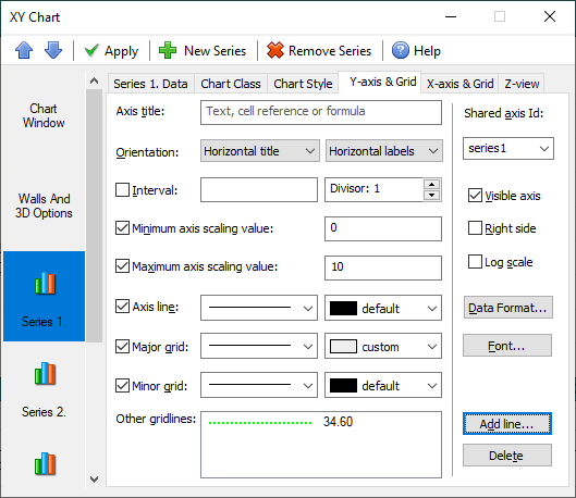
(For each chart you can define up to 16 axes with separate scaling and all
other parameters and add custom gridlines.)
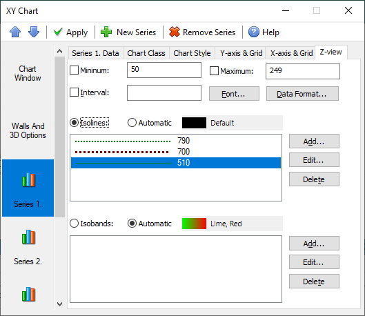
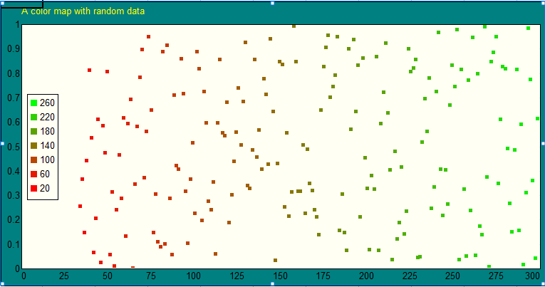
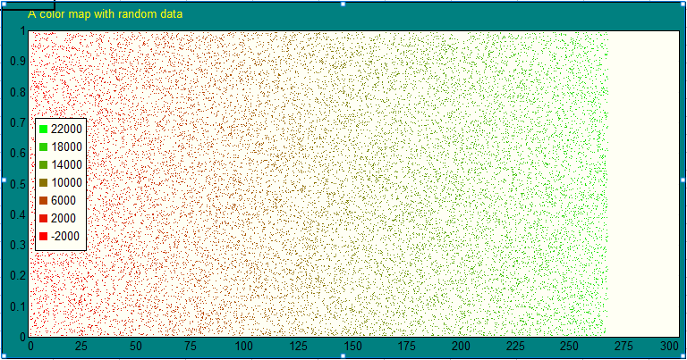
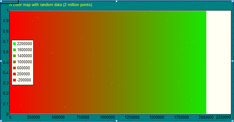
You can create color map charts with unlimited numbers of data points, with fully definable or automatic isobands. You can use them to show slices of 3D functions. Depending on the number of data points, the displayed point sizes decrease gradually.
For example, the “Chart” dialog box to display a sample color map chart
calculates the “Z” values for all XY point as z = sin(x) * cos(y)
where x,y are in the range (0, 2*PI).
(The data point symbols are automatically increased if there are too few data points to cover the XY-plane.)
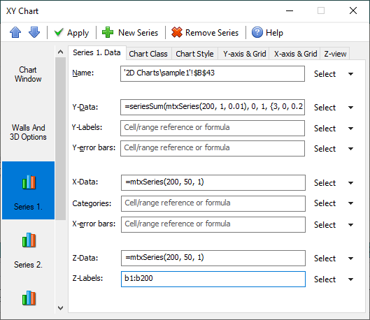
- Custom data point labels.
For each 2D chart you can easily add any specific labels to all data points
or selected data points. To turn this option on, select the desirable label
type on the “Chart > Style” tab as shown above.
The new “y-labels” and “z-labels” options requires you to specify their source
ranges/formulas and let you display any text/numbers for selected points. To achieve this you still need to define their ranges with the same number of cells
as the main data series range, but you can leave any of them empty. It can be
helpful e.g. to mark some points on path/route/trajectory charts or to additionally
highlight points with certain values.
If both “y-labels” and “z-labels” are specified at the same time, the “z-labels”
takes precedence over the former. In this case, if you want to display them both
at the same time, create “z-labels” as strings containing all the required information.
- Chart legend layout
Chart legends can be now also displayed both around the 2D XY chart plane or within it: